Good Flag, Bad Flag!
Meet Ted Kaye, the world's foremost authority on flag design, and learn how he scores my new blog banner.
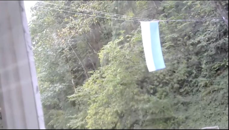
Every morning, Ted Kaye, a retired tech company CFO, hangs a different flag on the clothesline he’s strung across the dead end street facing his home in Portland, Oregon. An electronic sign installed in an upper window informs passersby of the flag’s identity. The day I interviewed Mr. Kaye over Zoom, he was flying the flag of San Marino: “The principality surrounded by Italy!”
Mr. Kaye is not just the secretary of the 750-member North American Vexillological Association (you know, the flag freaks), he’s author of Good Flag, Bad Flag, perhaps the world’s most influential guide to flag design.
As a volunteer, he’s consulted on flag design committees and competitions for nearly a hundred towns including Walla Walla, Washington and Salt Lake City, and even a few countries. He was technical advisor to the National Flag Committee of Fiji in 2015, “Though ultimately, they didn’t change it,” he said.
One of his latest efforts—assisting in the selection of a new flag for Burlington, Vermont. “It’s a very compelling design—by a pair of 12-year-old twins!” he said, displaying the flag in his home office.
I told Mr. Kaye that Good Flag, Bad Flag, his slim booklet available free as a PDF or for $3 on Amazon, was one of the funniest things I’ve read all year—especially the examples of good versus bad flags:
Mr. Kaye said he felt it was it important to show examples of failed banners: “I needed to drive a stake through the heart of the bad design ideas as well promote the good design ideas.”
Of course, some flag designs can be so bad, they’re good, as in the example of a banner from Pocatello, Idaho, rated dead last in the North American Vexillological Association’s survey of 150 US city flags, with a score of 1.48 out of 10. This flag had everything wrong with it: clashing colors, massive lettering, even a trademark notice running along the bottom:
“There was only one version of the flag existing, and it flew over the municipal sewage plant,” said Mr. Kaye.
Alas, stung by the criticism, the city updated its flag. The new design is somewhat less awesome:
Good Flag, Bad Flag delineates five basic principles of good flag design that include employing a maximum of 2-3 basic colors, and a strict ban on lettering. “If you have to write the name of your place on your flag, your symbolism has failed,” says Mr. Kaye.
Mr. Kaye also frowns on flags with seals, which all look alike. “It’s what we call an S.O.B. flag—seal on a bedsheet,” he says of the New York State flag:
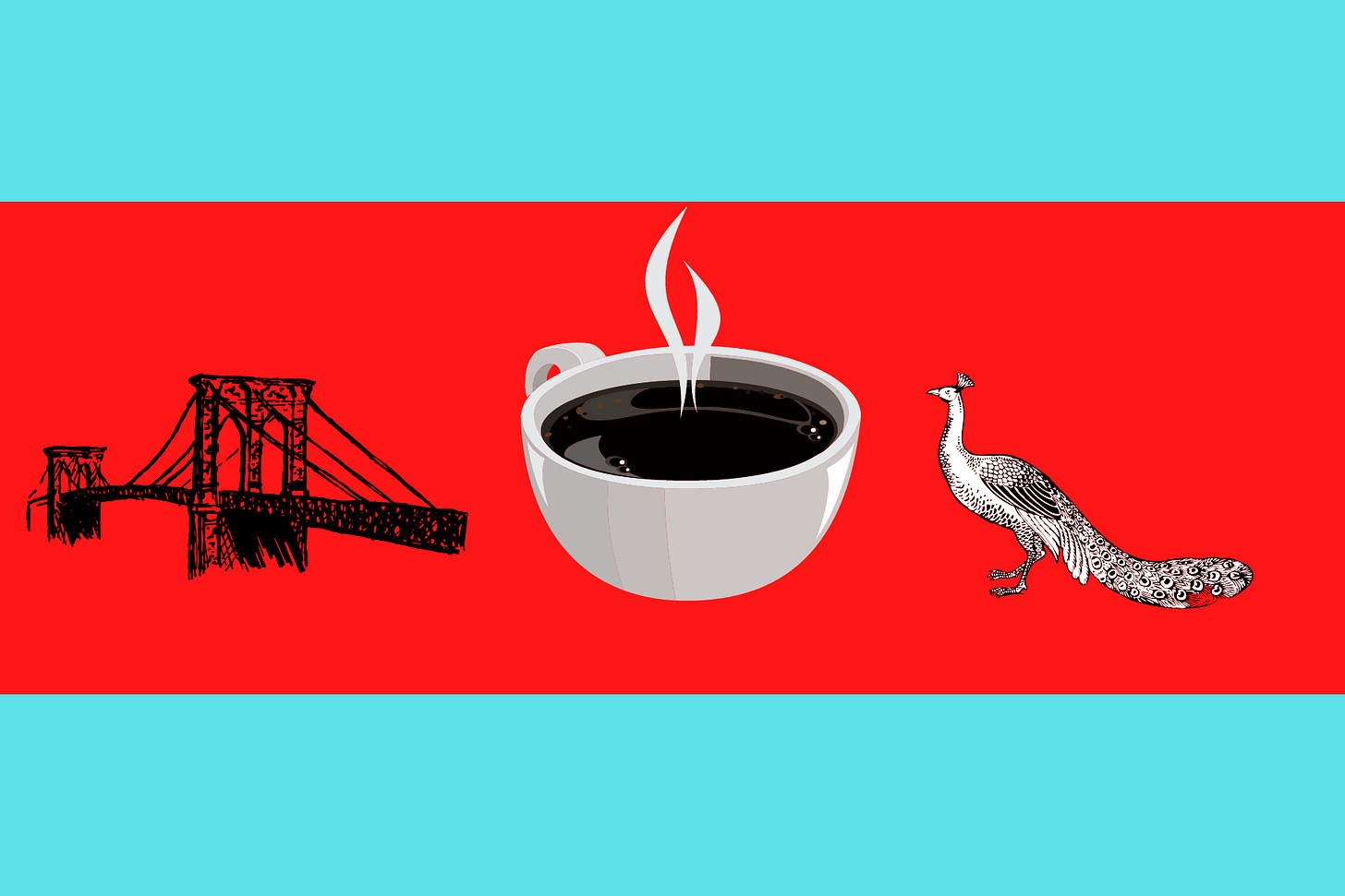
I asked Mr. Kaye to critique the flag I designed for this blog:
“HAHAHA!” said Mr. Kaye.
He paused. “So. Brooklyn Bridge, coffee and peacock. Okay.”
“What do you think?” I pressed.
“You’ve got a lot going on there—three different things,” he said. “You might consider having three different flags. Morning, noon and night.”
He scored my flag a two out of ten. Not much better than Pocatello.
So what’s an example of a great flag? Consider the official design adopted by the North American Vexillological Association, way back in 1967:
“If you check off the five basic principles of flag design, it wins on all of them,” said Mr. Kaye. “I’d give it a ten, and I’m being objective.”
Not surprisingly, Mr. Kaye has designed his own personal flag. It’s derived from signal flag for the letter K and forms the shape of the letter. For Kaye. Get it? It’s a great design:
Mr. Kaye, who also helped found the now-defunct international liberal arts school, World College West, does not have a favorite flag. There are, after all, more than 166,000 included on Flags of the World, an online encyclopedia crowd-produced by volunteer vexollogists.
And what does he think of the US Flag?
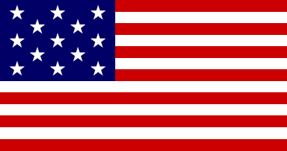
“It’s too complicated,” he said of our 50-star extravaganza. He prefers the original Continental Congress design:
He’s right! Perhaps we can revert.
Meanwhile, Mr. Kaye said he will continue his volunteer efforts, traveling to cities and towns around the globe to help them select better flags and upgrade old designs: “I like to say in every bad flag, there’s a good flag trying to get out.”


...hmmm... “There was only one version of the flag existing, and it flew over the municipal sewage plant,” said Mr. Kaye." Hmmm... there's something suspicious about Anne's Cafe and these mentions of municipal sewage plants. I just know it. Must be a code of some kind!
August is right around the corner, and that means just one thing: municipal sewage plant article time! Waiting with bated breath...