Meet NYC's Coolest Stealth Design Ninja!
Plus! Weird trash heap #26!! The $64 Reader Poll results!!!
Hello everyone,
Welcome to Issue #102 of CAFÉ ANNE!
First—and I know you’ve been waiting all week for this—we have the results of last issue’s $64 reader poll!
As regulars will recall, I recently received a $100 bill in the mail from a generous reader, which gave me a fun idea for how to celebrate the 100th issue of this newsletter. I exchanged the bill for $100 singles and went around the city asking 100 New Yorkers for a dollar’s worth of wisdom.
The resulting story was a hit, but now I had a new quandary. Of the 100 New Yorkers I stopped on the street, only 56 had wisdom to offer. And of those, only 36 took the cash. That left me with $64. How to spend the rest of the money?
Some readers suggested I treat myself to something nice, others suggested I donate it to a good cause, or fund another adventure. So I took a poll!
The favorite, with 56% of the vote—”Fund another adventure.” So that I shall do! But I’ll make sure my outing includes the other components. I’ll report the full story in next Monday’s issue—assuming I live to tell the tale.
In other news, last week’s story on adopting a personal uniform got a big response. Many readers emailed me essays detailing their own personal uniform journey, which were fun to read. I also got a lot of follow-up questions—people seem very interested in how often I do laundry! I’ll address them in an upcoming issue.
Meanwhile, huge first-NYC-snow-in-eons shoutouts to new paid subscribers Louise W., Jay, and Amanda G. That’s enough $$$ to buy a Valium for all my neighbors who freak out when there’s an inch of snow on the ground!
I am very excited for this week’s issue, of course. We’ve got a new weird trash heap, plus a Q&A with the delightful Max Kolomatsky, who goes around NYC redesigning street flyers for free! Please enjoy.
Regards!
Anne
Weird Trash Heap #26
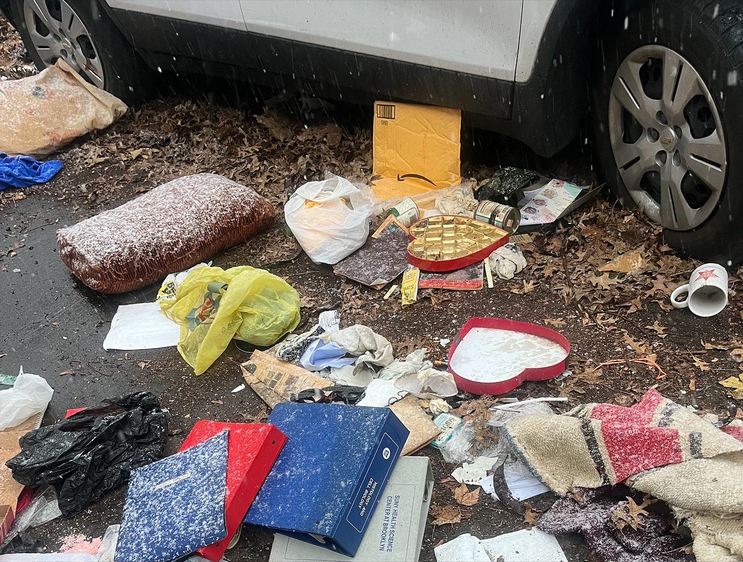
Thanks to the readers who, in response to my recent request, submitted a slew of great new weird trash photos. Among the best was this gem from Kelly M. in Clinton Hill, who spotted this snow-dotted heap on Clinton Avenue just north of Lafayette:
“Finally found a trash array weird enough to merit sharing,” Kelly wrote. “Components of note include swim goggles, a large, empty, heart-shaped chocolate box, some canned vegetables, and science-related binders of impressive width. Maybe the detritus of a romantic date night between a pair of vegetarian marine biologists?
Thank you Kelly!! I was the third wheel on that date, btw, and have the binder injuries to prove it!
Please send your weird trash photo to annekadet@yahoo.com and I will include it in a future issue.
FEATURE
Meet NYC’s Coolest Stealth Design Ninja!
It's official: my new favorite New Yorker is Max Kolomatsky, a 25-year-old designer who’s been secretly redesigning NYC street flyers for free.
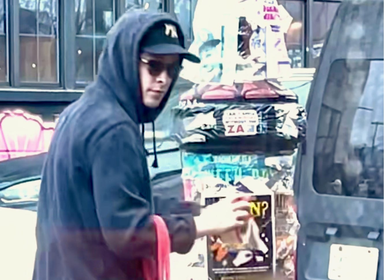
Last year, around this time, Mr. Kolomatsky, who grew up in New Jersey and lives in Bushwick with two roommates, was considering the flyers posted around the neighborhood by local small businesses. While most were delightful, some bordered on the truly incomprehensible. Mr. Kolomatsky, a freelancer with time on his hands, thought it’d fun to redesign these signs for free and hang them up in the same area—without telling the original creator. Then he posted short videos documenting his efforts on TikTok and Instagram.
The odd little project snowballed, bringing Mr. Kolomatsky a huge social media following and some big design gigs, but he's determined to stay true to his original vision of just having fun.
I was planning meet Mr. Kolomatsky for coffee last week, but then he got sick with the covids, and we met on Zoom instead. Still, it was a delightful interview, which I found very inspiring. I hope you do as well!
I was hoping we could start by talking about a couple of examples.
Sure! This is the latest one I've done. Sort of a superhero-themed one. For a cleaning service—The Clean Team.
It's in English and Spanish.
That is how the text was on the original flyer. I usually don't change much about the copy. That's not really my place. The project is more about showing people how much just changing the visual language can do.
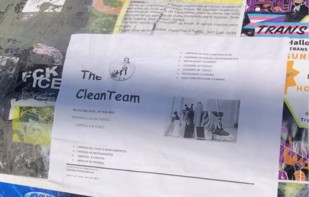
And now we're looking at a photo you took of the original flyer, which you found plastered to a mailbox. Big difference!
There's two images on it. One, which looks like clip art, with a woman next to the logo. And then there's a black-and-white stock image of some cleaning stuff. And the way that it's typed out, it's bulleted, and it's in Spanish and English, but they're not separated. So it's the kind of thing where I might have been the only person to actually stop and look at this flyer.
How long did it take you to create the new one?
I would say two afternoons. The illustration itself takes a while. I can be very indecisive, and I want the final to really represent the brand. So a lot of that time is just trial and error, auditioning different options.
How did you come up with the superhero theme and the color scheme?
I thought it would make for something eye-catching. Colors are my favorite part of making art, the thing that I think I'm best at. So I was going for something with a clean, friendly, shiny, soapy feeling.
Do you have a printer at home?
Yeah. I printed it out here, in my room. And I posted them around the vicinity of where I found the original—on a trash can, on different light posts.
Is there any mention of you on the new flyer?
No, there's no contact info. When I started doing this, I was very attracted to the idea of being anonymous. But that's something I'm thinking about changing, in case the business owner saw it and wanted to get the file and reproduce it. I could add some sort of QR code.
Do you imagine the business owner coming across your redesigned flyer? What do you think they'd think?
I feel like at first they'd be like, "There is a rival company with similar branding and the same name!" I love that thinking, because then they'd obviously be like, 'Wait, this is my phone number!'
It's probably confusing, but I'm sure they get it at a certain point.
I have to tell you, I love what you're doing. But I also love the poorly done, handmade business flyer.
Yeah, I love them too. I have to be very selective about how I choose. I don't want to take the charm away from the New York streets because the flyers can be really charming, especially when things are hand-drawn.
I think generally I'm looking for stuff that's actually confusing to read. If it's charming, if it's homegrown, and that adds to the aesthetic of the company, I'll leave it be. I won't touch it.
How about the Dan Smith Will Teach You Guitar guy? Have you thought about re-doing a flyer for him?
He's just so iconic. I can't touch his thing. Because I mean, you know about it, I know about it—he must be doing something right. I can't mess with him!
Do you have a favorite flyer redesign example?
Yes, I haven't posted it, but this is my favorite. It was a really intense transformation:
It started with a very small flyer. It looks like four business cards that were photocopied. It was as if he was trying to make them work as a rip-away. But it didn't work because there was no perforation or anything like that. And the text was so small. I thought that was kind of a fun opportunity for me to do a drastic shift.
I am proud of the new design. It's all the same information. But instead of listing the services out, I drew them. And I gave him a logo and gave him a slogan—"Can Do It!" This is one of the only times I changed some some text.
I'm curious to hear how this got started.
The very first sign was for people doing a board game night—people looking for someone to join their game of Catan.
You live in New York, right? These signs are everywhere. And it's something you don't even pay attention to, after a certain point. It just becomes a part of the backdrop of the city. I thought it could be an interesting focus for an art project. If I were to take something that's boring and forgettable and try to make it better. I thought I could use it as an example and make a video to show people how to design a good flyer.
I first thought, “Why don't I redesign this?" And then it just became a very logical next step, to put it up. And I think that really completed it. That was a big “aha” moment for me.
You started making videos for Instagram and Tiktok about the project. What happened?
It just a very immediate success, which was really unexpected. The first video I made was about the Catan flyer. It was pretty big, immediately.
I realized, only in hindsight, that it was something that people found a lot of value in. I sort of expected it to be a one-off thing. But people on the internet seem to like repetition. It's only done better and better.
How many followers did you have on Tiktok and Instagram this time last year, and how many now?
I'd been working on my Instagram for many years. I had maybe 20,000 followers, which was a lot. I was like, "I'm famous! 20,000!" I have probably 330,000 on Instagram now. And that's almost all people who found me through this project.
On TikTok, I maybe had 150,000 followers already. Now I think I have closer to 450,00. So there has definitely been big growth.
You create these flyers for free. How much would you charge for a job like this?
Starting at a couple hundred. But in a weird way, doing this very grassroots graphic design has pushed me away from doing this kind of work.
This used to be the kind of thing I would do almost all the time, back when I had a much smaller following. I did a lot of individual commissions. Like, “Draw my dog." I spent the summer of '21 doing branding for a donut shop in Dubai. I got a lot of younger people looking for an album cover, things like that. But this project has brought me to a different level.
What kinds of jobs are you getting now?
I get a lot of emails. A lot of people see these videos and I get suggestions from people offering to pay, and people thinking they might have the next flyer that I can redesign.
It's been a little bit overwhelming because I get hundreds of messages and can't respond to most of them, and a lot of people deserve a good flyer. I think I'm going to just stick to the flyers that I find on my walks around New York.
But in terms of the work I've been doing, I've been doing a lot more work with social media. This sign project caught the attention from someone from Adobe, and we have a bit of a partnership where I'll make videos for their account, for example.
You walk around the city a lot. What neighborhoods have the best fliers?
It's the busier streets. Like in my neighborhood, there's Broadway and Myrtle Avenue and Wyckoff. Brooklyn is good, in busy neighborhoods with a lot of businesses.
I also go into the Lower East Side and the East Village. There's weirdly a lot of young people that utilize flyer culture for their stuff. Midtown, and areas that have a lot of high rises, don't have a lot of flyers.
I understand the Catan gamers found your video on TikTok and contacted you. What did they say?
I haven't met with them yet. But I have their contacts and they're just like, really friendly people. They want me to play Catan with them. I've never played that game, but I have to do it at some point just for the story of it. But they were really excited. They thought it was awesome—they thought it was really funny.
The same with a goth band I made a flyer for. We met up in the park and I gave them signed copies of their flyer, and we took a photo.
Are you going keep going?
I certainly would like to continue. Eventually, I'd like to maybe have a whole book of these. But I don't want to burn myself out. There can be pressure on TikTok and social media to pump them out. But that's just not how I operate as an artist. I move slowly. I like to take my time with these.
I love your story. You did something just because it was fun, and it's turned into something much bigger than you imagined. Any advice for others?
I think there's something to be said for artists about making things unpaid. I know it is a struggle for a lot of designers. There's a lot of designers and artists who complain on social media because they get a lot of bullshit offers—they get people wanting to just pay them in exposure. It's kind of offensive in the designer community. But I think to keep your spirit alive as an artist, there is something to say about doing things just for kicks.
I'm not an expert in the world of professional arts, but in a few years, I've made the transition of doing art for fun to doing art as my job. And it can really kill your spirit to focus so much the next job. I think there is something really valuable about doing something for fun or for free. Just to put a smile on someone's face.
Why does that help?
It brings you back to why you do it in the first place. A lot of people who are designers, they went into graphic design because they were kids that loved to draw, and now that they design every day for other people, they probably don't do that anymore.
I think there's something kind of childlike about that, and it takes you back to that original creativity, where you get good ideas and tap into that freedom. I think it's important.
What I think I hear you saying, or that I'll say because I want you to say it, is that when you do things just for fun, you tap into a part of yourself that you couldn't otherwise access. And that is the part of yourself that only you can offer. And it's unique. And it's powerful. And it's something that people will want to pay you for, because no one else can do it.
Yes, you end up discovering things about yourself. I think, at least doing freelance, people are never going to ask you to just have fun and do whatever you want. They'll have a bunch of reference images. And it can be really easy to get stuck—to focus on just being good at something and having your craft be sharp. But I think creativity is this whole other muscle that has to nurtured as well. And for you to do that, it has to involve fun.
CAFÉ ANNE is a free weekly newsletter created by Brooklyn journalist Anne Kadet. Subscribe to get the latest issue every Monday!


Has to be one of your best people pieces ever Anne. As I read through the interview, I thought his observation that ‘People on the internet seem to like repetition’ was going to be it. My analogy being with TV soaps, which are more repetitious than the cowboy movies I watched in the 40s and 50s ever were, but you kept me waiting for the very best until the very end: I loved Max Kolomatsky’s ‘creativity = muscle’ idea/approach to what he does. I never thought of it before, but now I know the things I do every day (write, make boxes, draw maps, bake bread) strengthen me as a person, and they do. Suddenly, weeks away from being 80, there are ways in which I feel better about myself than ever before, thanks to you and Max. Bless you both - a truly, wonderful insight!🐰
Definitely one of my favorite issues, Anne! If Max is representative of his generation, there is hope for us all. I love that he recognized the charm of the handmade flyer on NY streets (although I am, sadly, not a New Yorker), since that isn't what I would expect to hear from a younger person these days. Something about that pure originality and imperfection has always appealed to me. And Max's philosophy of doing things just for kicks and especially if it puts a smile on someone's face, is something we all should try to do more often, artist or not. I think you and Max have a lot in common, both of you bringing joy for joy's sake, and having such a lovely outlook about the goodness of people. LOVE the idea of deliberately noticing people being kind to each other! I am going to start doing that whenever I go out.